import pandas as pd
import numpy as np
from matplotlib import pyplot as pltIntroduction to Classification in Practice
$$
$$
Recap
So far, we’ve been primarily considering the mathematical theory of machine learning, with a focus on a specific framework: empirical risk minimization for convex linear models. In the most general form that we’ve considered empirical risk minimization, we consider a loss function of the form
\[ L(\mathbf{w}) = \sum_{i = 1}^n \ell(\langle \mathbf{w}, \phi(\mathbf{x}_i) \rangle, y_i) \]
where \(\phi\) is a feature map and \(\ell\) is a convex per-observation loss function. We’ve studied where this framework comes from and how to solve the empirical risk minimization problem \[ \hat{\mathbf{w}} = \mathop{\mathrm{arg\,min}}_{\mathbf{w}} L(\mathbf{w})\;. \] using gradient descent, in which we perform the iteration \[ \hat{\mathbf{w}}^{(t+1)} \gets \hat{\mathbf{w}}^{(t)} - \alpha \nabla L(\mathbf{w}^{(t)}) \] until convergence. Assuming that our per-observation loss function is convex (as it is, for example, in logistic regression), gradient descent will always converge to the globally optimal \(\hat{\mathbf{w}}\) (although it might do so slowly).
But…
There are actually a lot of practicalities to consider here as well! Where does our data come from? How do we prepare it for analysis? If we are going to use a feature map \(\phi\) for things like polynomial features, how do we choose the right feature map? If our model has hyperparameters for things like regularization, how do we choose the right hyperparameters? All of these are questions that we need to handle in the practice of machine learning.
Our purpose in this lecture is to actually work through some of the common steps of the standard machine learning workflow.
The Titanic Data Set
The Titanic Data Set is something like the “Hello world” of machine learning. It collects information about almost 900 passengers aboard the Titanic during the fateful voyage when it crashed into an iceberg in 1912 and sank. The information includes their age; the fare they paid for their ticket (in British pounds); their sex; and the passenger class Pclass, with 1st class corresponding to VIP treatment and 3rd class corresponding to a much less luxurious experience. Crucially, the data set also records whether that passenger survived the sinking of the ship, with 1 indicating that the passenger survived and 0 indicating that the passenger tragically perished.
It is often convenient to represent tables of data as data frames. Data frames are implemented in multiple ways in multiple languages; we’ll work with data frames through pandas.
The following function will retrieve data from the url in which I’ve hosted the data set. It returns both the complete data (df, for “data frame”) and split pieces of the data that contain only the features and the target, respectively.
def read_titanic_data(url):
  df = pd.read_csv(url)
  y = df["Survived"]
  X = df.drop(["Survived", "Name"], axis = 1)
  return df, X, y
The reason I wrote a function is that we are going to read two data sets: a training data set and a testing data set. As we saw last time, the loss or score on the training data is not always a reliable guide to the ability of the model to make predictions on unseen data. For this reason, we are going to hold back a testing data set that we won’t actually download until we’re ready to evaluate our model. For now, let’s download the data on which we’ll train:
train_url = "https://raw.githubusercontent.com/middlebury-csci-0451/CSCI-0451/main/data/titanic/train.csv"

df_train, X_train, y_train = read_titanic_data(train_url)
Let’s take a look at the complete data frame:
df_train.head()| Survived | Pclass | Name | Sex | Age | Siblings/Spouses Aboard | Parents/Children Aboard | Fare | |
|---|---|---|---|---|---|---|---|---|
| 0 | 1 | 2 | Mrs. (Elizabeth Ramell) Nye | female | 29.0 | 0 | 0 | 10.500 |
| 1 | 0 | 3 | Master. Harald Skoog | male | 4.0 | 3 | 2 | 27.900 |
| 2 | 0 | 3 | Miss. Ebba Iris Alfrida Andersson | female | 6.0 | 4 | 2 | 31.275 |
| 3 | 0 | 3 | Mr. Frank John Goldsmith | male | 33.0 | 1 | 1 | 20.525 |
| 4 | 0 | 3 | Mr. Achille Waelens | male | 22.0 | 0 | 0 | 9.000 |
Prediction Question
The standard prediction question for this data set is:
Can we predict whether or not a given passenger survived the crash of the Titanic, given information about them and their position on the ship?
Data Inspection
Before modeling, it’s usually beneficial to learn about your data. It’s not always possible to do this without modeling, for example if your data is very high-dimensional. Because this data set has a relatively small number of features, we can learn a lot about it just through summaries. Let’s ask a few questions:
What percentage of passengers in the training set survived?
y_train.mean()0.3921015514809591Approximately 40% of passengers in the training set survived. It’s important to keep this in mind because it sets the base rate for our problem. The base rate is the accuracy rate of a trivial model that doesn’t use the features. In this case, the trivial model is the model that always predicts that a passenger died. This base model would be right about 60% of the time.
How wealthy were the passengers on the Titanic?
We can’t know for certain, but we can learn about how much was paid for each passenger class:
X_train.groupby('Pclass')[['Fare']].aggregate([np.mean, len]).round(2)| Fare | ||
|---|---|---|
| mean | len | |
| Pclass | ||
| 1 | 87.59 | 173 |
| 2 | 20.67 | 146 |
| 3 | 13.79 | 390 |
- The average price of 88 pounds for a first-class ticket corresponds to nearly $15,000 USD today.
- The second-class ticket corresponds to roughly $3,500
- The third class ticket corresponds to roughly $2,500.
We can safely assume that the first-class passengers were indeed substantially more wealthy on average than the others.
Did wealth disparities make a difference for who was most likely to survive?
We can segment out survival rates by passenger class to learn more about this:
df_train.groupby(['Pclass'])[['Survived']].aggregate([np.mean,len ]).round(2)| Survived | ||
|---|---|---|
| mean | len | |
| Pclass | ||
| 1 | 0.63 | 173 |
| 2 | 0.50 | 146 |
| 3 | 0.25 | 390 |
Indeed, the higher passenger classes had significantly higher survival rates.
This difference is even starker if we also segment out the data by the sex of the passenger:
df_train.groupby(['Pclass', 'Sex'])[['Survived']].aggregate([np.mean,len ]).round(2)| Survived | |||
|---|---|---|---|
| mean | len | ||
| Pclass | Sex | ||
| 1 | female | 0.97 | 72 |
| male | 0.39 | 101 | |
| 2 | female | 0.91 | 64 |
| male | 0.18 | 82 | |
| 3 | female | 0.51 | 109 |
| male | 0.14 | 281 | |
This table reflects the famous maritime tradition of prioritizing women and children first into the lifeboats, resulting in vastly higher survival rates among women in these data. Note the role of class: a 1st-class woman was twice as likely to survive as a third class woman, and a 1st-class man was nearly three times as likely to survive as a 3rd class man. Based on these observations, we might expect that passenger sex and Pclass might be useful features for us to incorporate into algorithms.
Data Preparation
So far, we’ve been working with 2d numpy arrays (matrices) of features and 1d numpy arrays (vectors) of target variables. We can treat pandas data frames of numbers like matrices, and we can treat pandas columns of numbers like vectors. For example, our y_train is already in a format that we can use:
y_train.head() # first few entries0 1
1 0
2 0
3 0
4 0
Name: Survived, dtype: int64On the other hand, our data frame has one column that we can’t use: the Sex column contains strings representing categories, rather than numbers. ML algorithms only understand numbers, and so we need to encode the Sex of the passengers as a number. We use so-called “one-hot encoding” for this, in which each category is represented by a binary column, with a 1 indicating that the passenger fell into that category. The Pandas function get_dummies() is an extremely convenient way to achieve this:
X_train = pd.get_dummies(X_train, columns = ["Sex"], drop_first = "if_binary")
X_train.head()| Pclass | Age | Siblings/Spouses Aboard | Parents/Children Aboard | Fare | Sex_male | |
|---|---|---|---|---|---|---|
| 0 | 2 | 29.0 | 0 | 0 | 10.500 | 0 |
| 1 | 3 | 4.0 | 3 | 2 | 27.900 | 1 |
| 2 | 3 | 6.0 | 4 | 2 | 31.275 | 0 |
| 3 | 3 | 33.0 | 1 | 1 | 20.525 | 1 |
| 4 | 3 | 22.0 | 0 | 0 | 9.000 | 1 |
This looks better! We can now treat X_train as a matrix of features and use it as an input for any of our machine learning algorithms.
Modeling
Now we’re ready to do some modeling! You may know how to implement logistic regression (and maybe you’ve already done it!), but for today we’ll use the scikit-learn implementation. We can already go ahead and fit our model. In sklearn, the score of a classification model is just the accuracy rate.
from sklearn.linear_model import LogisticRegression

LR = LogisticRegression()
LR.fit(X_train, y_train)
LR.score(X_train, y_train)0.7968970380818053So, our model achieves about 80% accuracy on the training data, which is much better than the 60% we could have achieved by random guessing.
Let’s take a look at the optimal parameter vector \(\mathbf{w}\). This is stored in LR in the coef_ instance variable:
pd.DataFrame({
  "column" : X_train.columns,
  "coefficient" : LR.coef_.ravel()
})| column | coefficient | |
|---|---|---|
| 0 | Pclass | -1.135432 |
| 1 | Age | -0.040872 |
| 2 | Siblings/Spouses Aboard | -0.387547 |
| 3 | Parents/Children Aboard | -0.137851 |
| 4 | Fare | 0.001768 |
| 5 | Sex_male | -2.623910 |
The way to read these coefficients is that when the number in the corresponding column gets larger, the odds of survival decrease. For example, the negative coefficient of Pclass means that someone with a larger value of Pclass (e.g. 3) has a lower chance of survival in the model than someone with a lower value (e.g. 1). Note that very strongly negative coefficient of Sex_male, which expresses the much lower survival rate of men.
At this point we could just go ahead and and evaluate our model’s predictive capabilities by downloading the test set and checking our predictive accuracy. However, we should ask ourselves:
Is this the best we can do?
We have all kinds of different choices that we can make that may help us improve our models. For example:
- From our first model it looks like
Faremay not be an especially strong predictor because of its small coefficient. Maybe our model would generalize better if we just didn’t include it? - Should we try incorporating some feature transformations, like polynomial features?
- Should we try regularizing our logistic regression?
We can’t exhaustively explore all possibilities, but let’s try to address one of these. Should we try incorporating polynomial features, and if so, of what degree?
from sklearn.preprocessing import PolynomialFeatures
from sklearn.pipeline import Pipeline
Let’s write a simple function that will construct a model with polynomial features for us:
def poly_LR(deg):
  return Pipeline([("poly", PolynomialFeatures(degree = deg)),
                   ("LR", LogisticRegression(penalty = "none", max_iter = int(1e3)))])
We can use it like this:
plr = poly_LR(3)
plr.fit(X_train, y_train)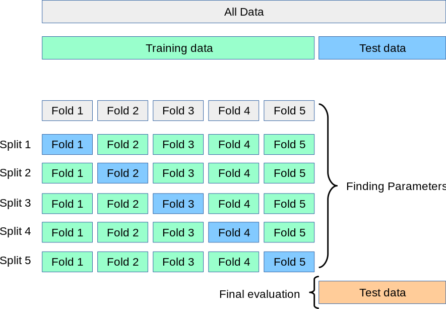
plr.score(X_train, y_train)0.7842031029619182Is that better or worse than the simple logistic model without polynomial features? Unfortunately we don’t really know; the reason is again that accuracy on the training isn’t usually a reliable indicator of predictive performance. In order to make an assessment, we can instead simulate the process of fitting the model and evaluating on “test” data by witholding parts of our training data to use as testing. We split the data into chunks and withold each chunk, using the other chunks to train the data. This is called cross-validation, and it is illustrated in this figure:
We could do this with a janky for-loop, but the nice scikit-learn developers have implemented this for us. Here’s an example of cross-validation with 5 folds. This can take a little while, as there are actually 5 calls to plr.fit() happening under the hood.
from sklearn.model_selection import cross_val_score
cv_scores = cross_val_score(plr, X_train, y_train, cv=5)
cv_scores
array([0.70422535, 0.76056338, 0.83098592, 0.83098592, 0.73049645])Each of these scores represents the model’s performance when used to predict one of the 5 folds of data after having been fit on the other 4. We often just average them to get an overall metric:
cv_scores.mean()0.7714514034561983Now we can try using cross-validation to get a sense for what degree of polynomial feature we should use. Degree 0 is actually the baseline model, and degree 1 corresponds to simple logistic regression without a polynomial feature map.
for deg in range(4):
  plr = poly_LR(deg = deg)
  cv_scores = cross_val_score(plr, X_train, y_train, cv=5)
  mean_score = cv_scores.mean()
  print(f"Polynomial degree = {deg}, score = {mean_score.round(3)}")
Polynomial degree = 0, score = 0.608
Polynomial degree = 1, score = 0.783
Polynomial degree = 2, score = 0.805
Polynomial degree = 3, score = 0.771It looks like it doesn’t make a huge difference, but degree-2 polynomial features might be our best bet according to cross-validation. Let’s try go ahead and fit a single copy of this model on the entire training data:
plr = poly_LR(deg = 2)
plr.fit(X_train, y_train)
Pipeline(steps=[('poly', PolynomialFeatures()),
('LR', LogisticRegression(max_iter=1000, penalty='none'))])In a Jupyter environment, please rerun this cell to show the HTML representation or trust the notebook. On GitHub, the HTML representation is unable to render, please try loading this page with nbviewer.org.
Pipeline(steps=[('poly', PolynomialFeatures()),
('LR', LogisticRegression(max_iter=1000, penalty='none'))])PolynomialFeatures()
LogisticRegression(max_iter=1000, penalty='none')
Let’s finally see how we do on the test set. We need to download the test set and process it in the same way that we did the training set.
test_url = "https://raw.githubusercontent.com/middlebury-csci-0451/CSCI-0451/main/data/titanic/test.csv"

df_test, X_test, y_test = read_titanic_data(test_url)
X_test = pd.get_dummies(X_test, columns = ["Sex"], drop_first="if_binary")
Now we’re finally ready to compute the score. Drumroll please!
plr.score(X_test, y_test).round(4)0.8483We achieve roughly 85% accuracy on the test data!
In case you’re wondering, our original logistic regression without polynomial features does almost as well on the test data:
LR.score(X_test, y_test).round(4)0.8427Breaking Down Accuracy
When evaluating the performance of our algorithms, it’s not usually enough to just compute an overall score. The confusion matrix of a classifier on the test data is a convenient way to understand the kind of mistakes that your model most frequently makes. To construct a confusion matrix, we can use the confusion_matrix function from sklearn.metrics.
from sklearn.metrics import confusion_matrix
y_pred = plr.predict(X_test)

confusion_matrix(y_test, y_pred)
array([[100, 14],
[ 13, 51]])This matrix compares the real values of the label on each data point to their predicted values. There are two possibilities for the labels and we are comparing to their predicted values, so we have four possibilities.
- True positive (TP): \(y_i = 1\) and \(\hat{y}_i = 1\). There are 51 true positives for this predictor on the test set.
- True negative (TN): \(y_i = 0\) and \(\hat{y}_i = 0\). There are 100 true negatives for this predictor on the test set.
- False positive (FP): \(y_i = 0\) and \(\hat{y}_i = 1\). There are 14 false positives for this predictor on the test set.
- False negative (FN): \(y_i = 1\) and \(\hat{y}_i = 0\). There are 13 false negatives for this predictor on the test set.
It’s possible to normalize the confusion matrix in order to compute some quantities of frequent interest, like the true positive rate, the false positive rate, the true negative rate, and the false negative rate.
The true positive rate is the proportion of the time that the classifier correctly categorized a positive instance, out of all positive instances.
\[ \text{TPR} = \frac{\text{\#TP}}{\text{\#TP} + \text{\#FN}} \]
The false positive rate is the fraction of the time that the classifier incorrectly predicted a positive instance, out of all negative instances. \[ \text{FPR} = \frac{\text{\#FP}}{\text{\#FP} + \text{\#TN}} \]
The true negative rate and false negative right are defined similarly. Normalizing the confusion matrix allows us to read off these rates:
confusion_matrix(y_test, y_pred, normalize = "true")array([[0.87719298, 0.12280702],
[0.203125 , 0.796875 ]])We observe that not only does our model make mistakes, it makes different kinds of mistakes. Not only that – it makes different kinds of mistakes on different groups! For example, let’s compare the model’s confusion matrices on test data for female and male passengers:
ix = X_test["Sex_male"] == 0
print("Female passengers:")
# print((y_test[ix] == y_pred[ix]).mean())
print(confusion_matrix(y_test[ix], y_pred[ix], normalize = "true"))
print("")

ix = X_test["Sex_male"] == 1
print("Male passengers:")
# print((y_test[ix] == y_pred[ix]).mean())
print(confusion_matrix(y_test[ix], y_pred[ix], normalize = "true"))
print("")
Female passengers:
[[0.3 0.7]
[0. 1. ]]
Male passengers:
[[1. 0. ]
[0.86666667 0.13333333]]
A few observations: on the test set…
- …when a female passenger survives, the model always correctly predicts this.
- …when a female passenger perishes, however, the model is actually still more likely to incorrectly predict that she did survive.
- …when a male passenger survives, the model almost always (87% of the time) instead incorrectly predicts that he perished.
- …when a male passenger perishes, the model always correctly predicts this.
We’ll go into much more detail on these rates in an upcoming lecture.
© Phil Chodrow, 2023